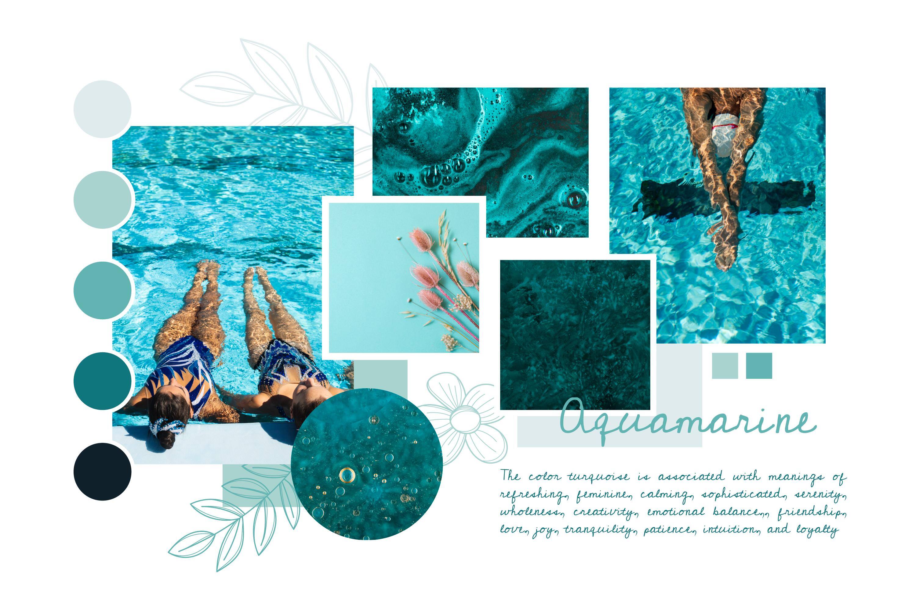
Good design is more than just aesthetics. It’s about communication, usability, and creating a strong visual identity. Whether you’re designing a website, social media post, or marketing material, following core design principles ensures your message is clear and effective.
1. Balance & Alignment: Creating Visual Stability
Balance refers to the distribution of elements in a design to create harmony. There are two main types:
-
Symmetrical Balance – Elements are evenly distributed, creating a structured look.
-
Asymmetrical Balance – Different elements vary in size and position but still feel visually balanced.
Proper alignment keeps content organized and guides the viewer’s eye naturally.
Tip: Use grids and guidelines to maintain structure in your layouts.
2. Contrast & Emphasis: Making Key Elements Stand Out
Contrast helps differentiate elements and grab attention. This can be achieved through:
-
Color contrast (e.g., dark text on a light background)
-
Font contrast (e.g., bold headings with lighter body text)
-
Size contrast (e.g., large headlines to emphasize key points)
Emphasis directs attention to the most important part of a design, such as a call-to-action button.
Tip: Use contrast sparingly to highlight important information without overwhelming the design.
3. Typography & Readability: Choosing the Right Fonts
Typography plays a major role in how information is perceived. A good font combination improves readability and brand personality.
-
Use serif fonts (e.g., Times New Roman) for a formal look.
-
Use sans-serif fonts (e.g., Helvetica, Arial) for a modern and clean feel.
-
Limit font choices to two or three to maintain consistency.
Tip: Prioritize readability by using appropriate line spacing and font sizes.
4. Color Psychology: Using Colors to Evoke Emotions
Colors influence emotions and brand perception. Understanding color psychology helps in designing more effective visuals.
-
Blue – Trust, professionalism, stability (used by corporate brands)
-
Red – Energy, urgency, passion (used for sales and promotions)
-
Yellow – Optimism, creativity, warmth
-
Green – Growth, health, sustainability
-
Black & White – Minimalism, sophistication
Tip: Use a color palette that aligns with your brand identity and industry.
5. Simplicity & White Space: Avoiding Clutter
Simplicity ensures a clean, professional design, while white space (negative space) helps avoid clutter and improves readability.
-
Focus on one key message per design
-
Remove unnecessary elements that don’t add value
-
Use ample white space to make content easier to digest
Tip: A simple, well-structured design is more effective than a complex one.
Final Takeaways
-
Use balance and alignment for visual stability.
-
Leverage contrast and emphasis to highlight important elements.
-
Choose readable fonts and maintain consistency.
-
Apply color psychology to evoke emotions.
-
Keep designs simple and uncluttered for maximum impact.
Design is about communication, every choice should serve a purpose. By following these principles, businesses can create compelling visuals that enhance their brand and engage their audience.
Need Professional Design Support?
Aideology specializes in branding, design, and digital marketing. If you need expert help, get in touch today.


Leave a Comment